Hello everyone, today let’s create a component that displays an icon and text color for records based on some condition in aura using a lightning data table. If you have not followed our beginner lightning development series, please check here. Salesforce Lightning Tutorial For Beginners.
Table of Contents
Conditionally Add Icon And Text Color For Records In Salesforce Lightning DataTable
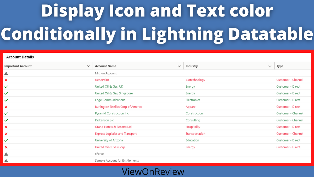
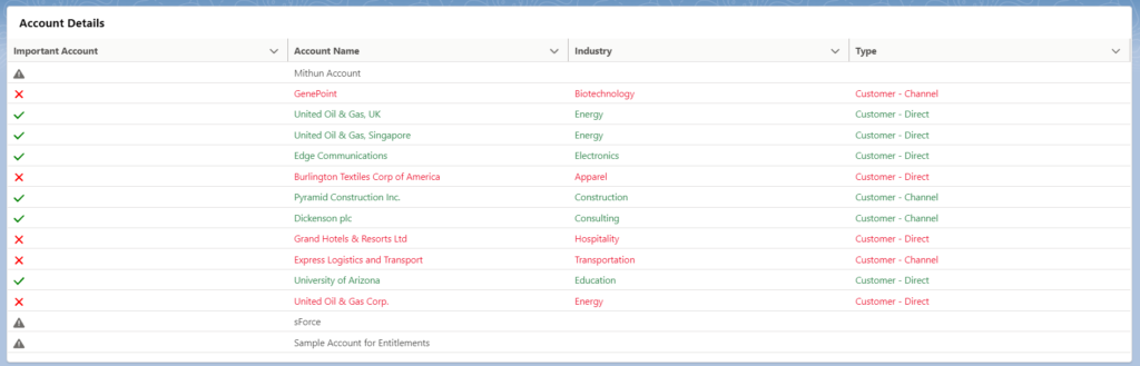
Problem Statement: – Suppose the account record is Active then show that account row in green color and show the Utility check icon, suppose it is No, then show a row with red color and show the icon as utility wrong, and suppose if it is blank then show the warning icon and normal text color. Let’s see how we can develop this component using lighting datatable.
Note:- Here we have leveraged the existing picklist field available in the account object i.e Active__c. So now let’s go ahead and create our component.
No, let’s start with creating an apex class.
AccountHandler.apxc
public class AccountHandler {
@AuraEnabled
    public static List<Account> featchAccount() {
        return [SELECT Id, Name,Industry,Type,Active__c FROM Account];
    }
Read the best salesforce Books: Click Here.
Here the apex class returns a list of accounts. Now let’s develop a component file.
ShowIconandTexColor.CMP
<aura:component implements="flexipage:availableForAllPageTypes,flexipage:availableForRecordHome,force:hasRecordId" access="global" controller="AccountHandler">
    <aura:handler name="init" value="{! this }" action="{! c.init }"/>
    <aura:attribute name="columns" type="List"/>
    <aura:attribute name="data" type="Object"/>
    <lightning:card title="Account Details">
   //Data Table to display  as table
        <lightning:datatable
                             columns="{! v.columns }"
                             data="{! v.data }"
                             keyField="id"
                             hideCheckboxColumn="true"
                             />
    </lightning:card>
</aura:component>
In the above CMP field, we have created a columns attribute that holds a column’s value that will be declared in the Js file and one more attribute data that holds a collection type of object. So now let’s create the Js component.
ShowIconandTexColor.JS
({
    init : function(component, event, helper) {
        //Data table columns value.
        component.set('v.columns', [
            {label:'Important Account', fieldName: '',
             cellAttributes:{
                 class: { fieldName: 'Active__c' },
                 iconName: {
                     fieldName: 'displayIconName'
                 }
             }
            },
            {label: 'Account Name', fieldName: 'Name', type: 'text',
             cellAttributes:{
                 class: { fieldName: 'colortext' }}},

            {label: 'Industry', fieldName: 'Industry', type: 'Picklist',
             cellAttributes:{
                 class: { fieldName: 'colortext' }}},
            {label: 'Type', fieldName: 'Type', type: 'Picklist',
             cellAttributes:{
                 class: { fieldName: 'colortext' }}}
        ]);
        //Calling Server side apex method
        var action = component.get('c.featchAccount');
        action.setCallback(this, function(response) {
            //store state of response
            var state = response.getState();
            if (state === "SUCCESS") {
                //Storing response in records variable.
                var records = response.getReturnValue();
                //Iterating over a records.
                for ( var i = 0; i < records.length; i++ ) {
                    //Checking record active field value.
                    //If found, setting icon to utility:check
                    //And setting color to sucess.
                    //Same if and else condition added for rest conditions.
                    if ( records[i].Active__c=="Yes" )  {
                        records[i].displayIconName='utility:check';
                        records[i].colortext='slds-text-color_success';
                    }	else if( records[i].Active__c=="No"){
                        records[i].displayIconName='utility:close';
                        records[i].colortext='slds-text-color_error';
                    }
                        else
                        {
                            records[i].displayIconName='utility:warning';
                            records[i].colortext='slds-text-color_weak';
                        }

                }
                //Once Conditons staisfies add it to the attribute using component.set.
                component.set('v.data', records);
            }
        });
        $A.enqueueAction(action);
    }
})
Read the comment to understand. Now we are done with Js, so let’s add some CSS to this component.
ShowIconandTexColor.CSS
.THIS .Yes svg {
   fill: green;
}

.THIS .No svg {
   fill: red;
}

.THIS .null svg {
   fill: red;
}
Now we are done with our component, let’s add this to the app page and see how it looks like.
Add the Component to the App Page
Conclusion
Congratulations, you have successfully created a lightning component. If you liked this post, please share it with your friends and colleagues. we will meet in, another awesome lightning component development. Also please read our below post on the lightning components.
Also Read
- Icons – Lightning Design System
- Component Library
- Read the best salesforce Books: Click Here.
- HTTP Callout in Salesforce Flow Without Code [GET & POST]
- How to Invoke a Flow from a Lightning Web Component
- How to update child records using salesforce flow
- How to Assign records to Queue using Salesforce Flow?
- How to create a Data Table in Salesforce Flow : Complete Guide.
- How to retrieve record Type Id in flow
- How to navigate record detail page in flow
- How to send email using flow in salesforce
- How to Display Icon In Lightning Datatable
- How to Create Record in lightning Component
- How to Delete Multiple Records Using Checkbox In Lightning Component.
7 thoughts on “How to Display Icon In Lightning Datatable”